 to open
Simulation Draws window to select the number combinations to be used as
simulated winning numbers and start the draw simulation process.
to open
Simulation Draws window to select the number combinations to be used as
simulated winning numbers and start the draw simulation process.Draw simulation is available in Latest History window and Summary History window. It calculates and collects History sums for a selected set of number combinations and presents them as a histogram table and chart. The histogram then shows what is statistically most likely to happen with History values in the next draw.
Click button
to open
Simulation Draws window to select the number combinations to be used as
simulated winning numbers and start the draw simulation process.
When the draw simulation is finished, the results are presented in a table in the upper half of the window. Each table row contains the results for a single History Level. The tables columns are:
![]() Toggle button
Toggle button
 to show draw simulation results as differences from the latest draw, toggle
 button to show simulation results as absolute sum values.
![]() Click any column header to sort the table in ascending or descending order.
Click any column header to sort the table in ascending or descending order.
The lower part of the window is histogram chart showing draw simulation results for selected Level. A section of that chart is automatically transferred to Simulation hint in My Estimates window:
The figure below shows the simulation histogram for Expert Lotto 6/49 Demo lottery generated from all possible combinations:
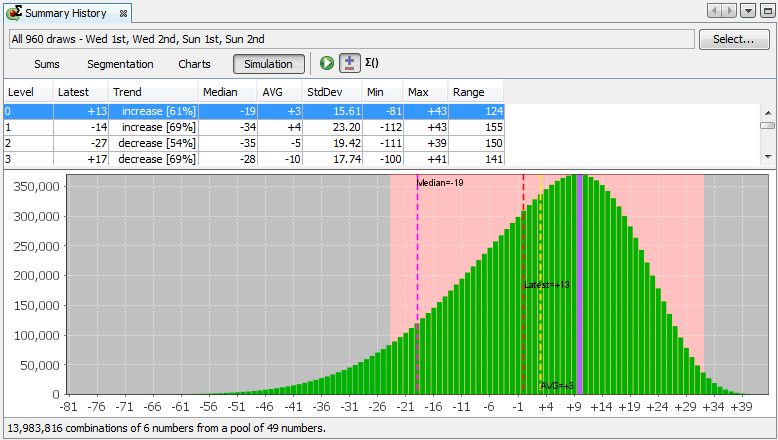
The most frequent value is +10 which was simulated 371,183 times. Let's assume that occurrence tresholds in History settings window are set to 15% and 10% respectively.
Fifteen percent of 371,183 is approximately 55,677. So the range estimate will include differences that were simulated at least 55,677 times, that is differences greater than -27.
Ten percent of 371,183 is approximately 37,118. So the range estimate will include differences that were simulated at most 37,118 times, that is differences lower than +33.
Pink background in the figure above highlights the section of simulation histogram that is automatically transferred to My Estimates window for occurrence thresholds set to 15% and 10% respectively.
You can refine the hints in My Estimates window by zooming a section of the histogram chart:
![]() Blue bar in the histogram chart denotes the most frequent sum or difference from the simulation results.
Blue bar in the histogram chart denotes the most frequent sum or difference from the simulation results.
![]() Black dotted line in the histogram chart denotes the sum or difference corresponding to the current what-if numbers.
Black dotted line in the histogram chart denotes the sum or difference corresponding to the current what-if numbers.
![]() The whole histogram is projected into History Sum and History Differences charts as a grey gradient bar. Darker color denotes values with higher occurrences, lighter colors denote History values occurring only very seldom in the simulation results.
The whole histogram is projected into History Sum and History Differences charts as a grey gradient bar. Darker color denotes values with higher occurrences, lighter colors denote History values occurring only very seldom in the simulation results.
The status bar at the bottom of the window shows the count of tickets that were used for draw simulation and ticket filter applied on those tickets (if any).
![]() See also History Level Synchronization.
See also History Level Synchronization.